I work on the Search team here at Shutterstock. This team is responsible for building all the user experiences related to search—most notably, the image/video search results page, the asset details page (which you see when you click an image on the search results page), and so on. One of the advantages of our new experience, from an engineering perspective, is that it’s all written with React, which allows us to rapidly iterate and easily share common pieces of functionality across the whole site.
Our previous search interface was not built with React, so we could reuse very little of the existing logic. As such, we needed to build a new image grid. Before I get into our solution, I’ll give a little background information on what we call “brick grids” and the different kinds there are. A brick grid is essentially an asymmetric grid of rectangles, sort of like bricks in a wall. Let’s go over a few of the different kinds of these grids that exist.
Types of Brick Grids
Column-Wise Grids
One popular flavor is the “column-wise” grid (our own term), which lays out images in variable-height, fixed-width columns on the screen. Here’s an example:

This may look familiar to you. Some very well-known websites (such as Pinterest) use this kind of grid to display their content. This kind of grid is ideal if you have a lot of portrait-shaped content.
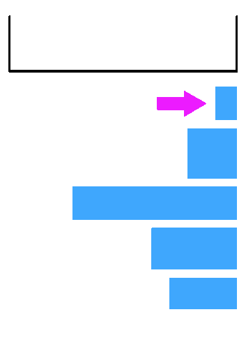
Row-Wise Grids
Another style of grid, which is very common for sites like Shutterstock whose primary concern is displaying images of any orientation or shape, is the row-wise grid. Row-wise grids lay out their content in fixed-width, variable-height rows. Here’s an example:

The previous Shutterstock search experience used a grid like this, and the new experience does as well. This type of grid is a solid choice if you are displaying images of varying shapes, as it does a surprisingly good job of displaying both portrait- and panorama-shaped images, as well as every shape in between.
Inca Grids
The Inca grid is the proverbial “Holy Grail” of brick grids. Inca grids lay out their rectangles completely asymmetrically, with no regard for rows or columns. We coined the term “Inca grid” because of their resemblance to Inca stonework. Here’s an idealized example:

You’ll notice I said idealized. These grids are very cool, both intellectually and visually (when they look like the above example), but it is virtually impossible to guarantee that arbitrary content will be displayed perfectly inside of them. In the case of images, you have to aggressively crop and resize to get the images to fit together like the above example. Even after doing that, unless you are willing to make some images very small (beyond the point of legibility), you will still have gaps in your grid (yes, this comes from experience — it was a fun company hackathon).
Making a Row-Wise Grid in React
We decided that a row-wise grid would be the best option for our new search results page. Here were some of our requirements for this new grid:
- It should be responsive — it should look good on any screen size.
- It should be performant — it should render quickly.
- It should be flexible — it should allow us to fully customize the content items.
- It should allow for interstitial row content — it should let us inject a row of new, completely arbitrary content between rows.
We dove into research, trying, like true JavaScript developers, to find an open-source React library that solved all these problems out of the box. (You may be asking at this point: “Why not use CSS?” Because the current CSS grid solutions don’t allow you to create a true row-wise grid like the example shown above.)
We found some options, the best of which we’ll list here:
- react-grid-gallery — This wonderful library is almost exactly what we wanted. At the time we looked at it, however, the library did not support interstitial row content, and had extra features, such as being able to select images, that we didn’t need, and unfortunately that meant a larger frontend bundle size for no benefit.
- react-photo-gallery — This is a nice library that produces beautiful layouts, but we couldn’t use it because it uses a fixed number of photos per row.
- react-component-grid — Another great piece of work, but unfortunately not quite right for our needs, as the images are displayed in fixed sizes.
We also explored some vanilla JS libraries and determined that none of the ones we found were suitable for our needs. (Our pre-existing solution on the legacy search experience wouldn’t work either, due to it laying out items with absolute positioning.) We concluded, then, that our best option was to implement our own component! This realization was, for me, like opening a birthday present. This would be a fun problem to work on.
I thought that perhaps this qualified as a bin-packing problem. In that vein, I Googled “bin packing”, looked at the Wikipedia page, and followed some of the external links. One of the links led to this helpful page, which explained several greedy approximation algorithms. The first fit (FF) algorithm drew my attention, so we set out to implement it in JavaScript. Remember that one of the requirements was to allow for interstitial row content. We decided to make the algorithm generate a 2D array of objects representing the packed rectangles. That way, in the React component, we could write some code like this:
<div className=”grid”>
  {rows.map((row, rowIndex) => (
    <div key={row[0].id} className=”grid-row”>
      {row.map((image) => (
        <GridCell key={image.id} image={image}/>
      )}
    </div>
  ))}
</div>
If you’re a React developer, this pattern probably looks very familiar to you. We’re mapping over a 2D array of packed images and throwing them into the DOM with very little fanfare. The benefit of this is that it allows us to easily make an interstitial row by adding the following into the .grid-row div:
{
  interstitialIndex === rowIndex &&
  <div className=”interstitial”>
    {interstitialContent}
  </div>
}
In this sample, interstitialIndex is a prop (defaulted to -1) that we pass to our component. And that solves the interstitial problem! That was the easy part, however. We still haven’t described the actual layout algorithm. That’s next. We’ve covered all the essential React code already; the remainder of this post will focus on the algorithm behind the grid.
First-Fit Packing Algorithm
We wrote a couple different versions of the packing algorithm. Our first attempt used the “first-fit” heuristic, meaning that we greedily pack the first rectangle that will fit into a row, into that row. Here’s a gif showing how that worked (the animation shows the packing of a single row):

The algorithm repeated this process for all the images until there were none left that could be packed. Images that wouldn’t fit into the current row would be put into the next row, or the next row after that. This algorithm was a good start, but there were problems:
- It doesn’t handle images that are longer than the width of the row.
- It doesn’t look nice — some images are taller, some are shorter, and the full width of the row isn’t necessarily filled.
- Order of input rectangles is not preserved.
Number 1 can easily be solved in a couple different ways, one of which is to check if the image currently being inserted is wider than the current row, and if so, scale it down to fit within the row, then check again if it will fit (ideally, preserving its now-scaled size so the scaling only happens once). This can even be done as a pre-processing step for all images, since all rows have the exact same width.
The second two problems are trickier. While we were hopeful that we could get away with not preserving the order of input images, alas, it was not to be so (preserving order turned out to be a hard requirement). Therefore, we had to develop what we call the “force-fit” packing algorithm.
Force-Fit Packing Algorithm
It occurred to us that if we could scale images down so that they were guaranteed to fit in an empty row, why couldn’t we scale them even more to fit in the remaining space of a row? We would need some kind of check to ensure that we didn’t scale them too much in either direction, but if we could figure that out, maybe we had a chance at preserving order. Let’s look at an animation of the second and final attempt, an algorithm we call “force-fit bin-packing”:
This algorithm is a little more complex. Again, we iterate through each image, but this time, if one doesn’t fit, we resize it to fit in the remaining space, assuming there’s enough space left in the row and resizing the image wouldn’t make it too big or too small. We created a formula for determining this which looks at the ratio between the target row height (more on this later) and the width of the rectangle we’re trying to pack and uses these bits of information to see if we should pack the given rectangle.
This algorithm is better than first-fit for our purposes — now we’re preserving order! But there’s still the pesky problem of the rectangles not looking good once they’re packed. They’re all different heights and the row width isn’t filled! Yuck. We’re down to problem #1: making the rectangles look perfect once they’re packed.
Perfect Packing
First, credit where credit is due. To solve this problem, we looked at the source code for react-photo-gallery. We applied the technique that library uses and it worked splendidly, so thanks, neptunian (the creator of the library), and all the contributors! Now we’ll describe the technique and how it works and why it makes sense. (Also, thanks to a fellow Shutterstock engineer, Jesse Weaver, for helping us figure out a good way of explaining this.)
Suppose we have this packed row:

The row itself has the dimensions 40x10. Note that these are the initial row dimensions, not its final dimensions. In this example, 40 would be the width of the div containing the grid in our React component. As for 10, it’s the “target row height”, which is an argument you pass to the algorithm. The target row height is a sort of “starting height” for our rows that we can use for our calculations (as you’ll see below). It’s also the height the consumer wishes the rows would be in an ideal world, hence its name.
The inner rectangles’ dimensions are all shown in the figure above. How can we resize these rectangles to fit precisely inside the row with no unused space? We cannot. But we can resize them to fit in a row with the same width and some roughly similar height, which we’ll calculate. Let’s start by resizing all the rectangles so that their heights match the target row height:

It’s already looking promising. The new widths and heights are shown. Unfortunately, our longest rectangle is now 50 long, which is longer even than the width of the row by a nontrivial margin. How can we scale these images down so that they fit within the 40-wide row? Let’s start by finding the width and height of the row which does contain these rectangles.
We already know the height, that’s 10. But what’s the width? Easy enough, let’s add up the rectangles’ widths: 6.67 + 10 + 50 = 66.67. The row which contains these rectangles, then, is 66.67 x 10. That’s not going to work for us, obviously, as it flows way outside the edges of our container. However, it’s useful to know these dimensions, because we can get the aspect ratio from them. Aspect ratio = width / height, so our aspect ratio is 66.67 / 10 = 6.67. With this in mind, we can now scale the bounding rectangle down to our desired width, 40, and see what its new height is:
aspect ratio = w / h
6.67 = 40 / h
h = 40 / 6.67 ≈ 6.00
Okay! Our row should be 40 x 6 (note that all of our answers have been rounded, hence why we ended up with 6 rather than 5.997). Now we have to scale all of our rectangles down to fit within that row. We know they will fit because the new row’s aspect ratio is the same as the one that they did fit in! Here’s what our final row looks like:

Neat huh? Let’s see how the algorithm works as a whole.
The Final Algorithm
Here is some very high-level pseudocode that demonstrates how one might implement the final algorithm:
/**
* @param rectangles {Array} - Array of objects with `width` and `height` properties
* @param idealRowDimensions {Object} - Object with `width` and `height` properties
**/
fn packIntoRows(rectangles, idealRowDimensions)
  // start with an empty array of rows
  rows = []

  // step 1: pack all rectangles into rows -- O(N)
  for each r in rectangles
    row = last(rows) || makeRow(idealRowDimensions)
    if NOT fitsInRow(row, r)
      row = makeRow(idealRowDimensions)
      rows.push(row)

    addToRow(row, r)

  // step 2: normalize all the rows -- roughly O(N^2)
  // because normalize() is O(N)
  for each row in rows
    normalize(row, idealRowDimensions)

  return rows
First, you’ll need to write makeRow, which should return a new array with some extra properties added to it, such as remainingSpace (initially set to idealRowDimensions.width) and aspectRatio (initially set to 0). Then, you’ll have to write fitsInRow, which determines if a rectangle fits in a row by using the row’s remainingSpace property and the rectangle’s width. Furthermore, you’ll need to write addToRow, which subtracts the current rectangle’s width from the row’s remainingSpace property and adds the current rectangle’s aspect ratio (which can be calculated from its width and height) to the row’s aspectRatio. Lastly, you’ll need normalize, which utilizes the row’s aspectRatio property (which we calculated in addToRow) to perform the perfect packing described in the section above. Note that you will probably also want normalize to not perfectly pack the last row if certain conditions are met.
The algorithm as we have implemented it is O(n2), which isn’t ideal, but for practical purposes, it’s fine. We only ever display as many as 100 images, and benchmarking has shown that running the algorithm for this many items normally takes < 1 millisecond. We could have gotten more creative and attempted to use a binary tree, a technique used for certain sprite-packing algorithms, but such an approach would be problematic at best for us, because a) we can’t change the order of our items, and b) we need to be able to split our items into “rows” (which would be possible, but more challenging).
Conclusion
I hope you’ve found this post interesting. In the end, creating a brick grid is hardly the most challenging or interesting computer science problem, but I thoroughly enjoyed working on it, and if you choose to create one for yourself, perhaps you will enjoy it as well. If you get stuck, just remember: if at first you don’t succeed, try, try again.